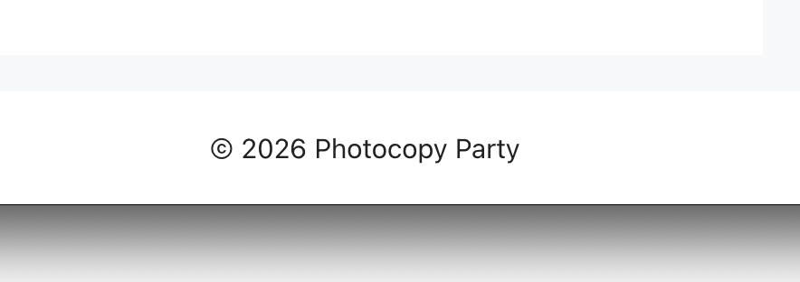
Here’s the solution add this additional CSS to your theme:
.copyright-bar {
display: grid;
grid-template-rows: auto 0px 0px;
overflow: hidden;
}
Here’s the long version:
I never intended to do anything fancy with this blog. I wanted a basic template that did basic things and didn’t get in the way and let me post whatever I wanted without too much hassle. I came across the GeneratePress theme and it looked like perfect so I installed it and went to town.
I didn’t love that the footer included their watermark but I wasn’t terribly upset about it. You can pay to unlock premium features to customize it if you really want but that wasn’t what I was about. Anyway this is what it looks like.
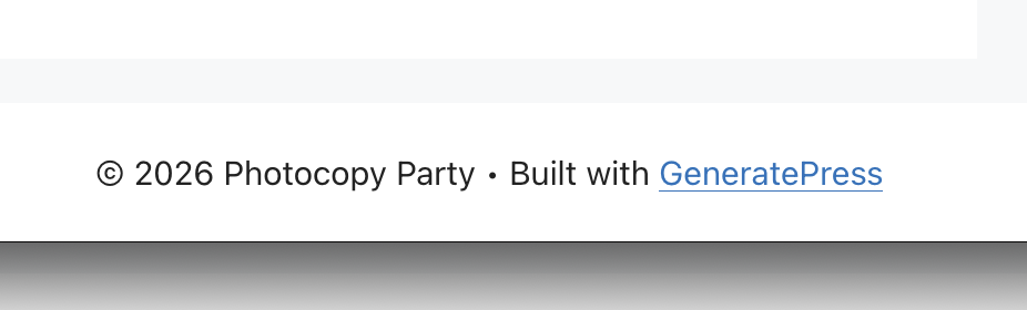
All things considered it’s very understated and I appreciate that they didn’t slop bigger watermarks on things. If it got too hairy to try and remove the extra watermark text I was going to leave it because I don’t care that much.
I search a number of terms and saw some results but nothing was really what I was looking for. People doing all manner of shenanigans to hide the text. Part of the challenge for novices is that the “• Built with” is text inside a div and the copyright and link are inline elements so you can’t easily write CSS that targets the text and the link and hide the text without some silliness. People have written server-side logic to tweak things but I don’t want to risk a change that will cause problems if the renames methods in an upgrade.
The silliness that I chose was putting things into grid mode. When you use “display: grid;” everything becomes a grid element so everything becomes targetable by the grid. With only that command you can see that the 3 text elements stack. The copyright, the text, and the link all sit neatly in a vertical column.
But we only really care about the first one so set the row height with “grid-template-rows: auto 0px 0px;” so that the first item, the copyright gets the correct height, and the other items get nothing. If you only used those 2 commands the last two items hang out at the bottom outside the content block but still visible.
So throw an “overflow: hidden;” on the block and you get the perfect layout. No huge changes. No redefining files or layout variables. Easy peasy.